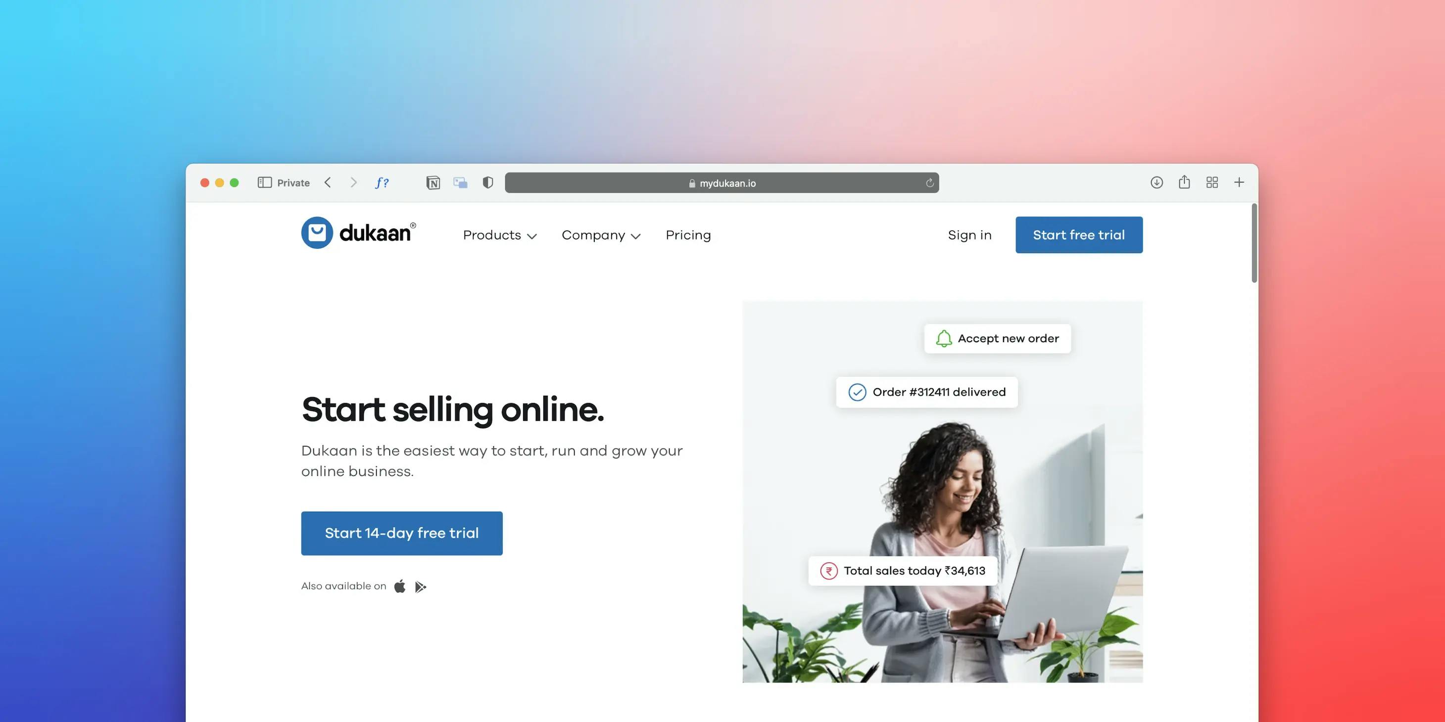
Boosting Conversions: A Guide to Effective Call-to-Action Design
In the digital landscape, where businesses strive to engage and convert online visitors, the role of call-to-action (CTA) buttons cannot be underestimated. These small yet powerful elements act as catalysts for user action, directing visitors towards specific goals that align with business objectives. A well-designed call-to-action button has the potential to significantly boost conversions and drive desired outcomes. In this comprehensive guide, we will delve into the principles of effective call-to-action design and explore actionable tips to enhance conversions on your website.
Crafting Compelling Copy
One of the fundamental elements of an effective call-to-action button lies in its copy. The words used must be concise, compelling, and action-oriented. By employing action verbs that create a sense of urgency, such as "Get Started," "Sign Up Now," or "Shop Today," you can instill a feeling of motivation in users to take immediate action. Additionally, the copy should align with the specific conversion goal, clearly communicating what users can expect when they click on the button. A well-crafted call-to-action copy engages users and entices them to proceed further.

Design for Visibility and Contrast
The visual prominence of a call-to-action button is paramount to its success. It should stand out from the surrounding elements and be easily noticeable on the webpage. Achieving this requires careful consideration of color contrast and strategic use of whitespace. By choosing contrasting colors that complement your overall design, you can ensure that the call-to-action button grabs users' attention. Moreover, employing whitespace effectively can create visual focus, drawing the eye towards the button and encouraging action.
Strategic Placement and Hierarchy
The placement of call-to-action buttons plays a significant role in their effectiveness. Ideally, they should be positioned prominently on the page, where users can easily locate them without excessive scrolling. Consider the natural flow of user attention and strategically place CTAs where they make logical sense in the context of the content. Moreover, utilizing visual hierarchy techniques, such as size, color, and proximity, can emphasize the importance of the call-to-action and guide users towards taking the desired action.
Responsive and Mobile-Friendly Design
With the increasing prevalence of mobile devices, it is essential to design call-to-action buttons that are responsive and mobile-friendly. Ensuring that buttons are large enough to be easily tapped on smaller screens and that the text remains legible is crucial. Optimize the layout to provide a seamless user experience across different devices and screen sizes, allowing users to engage effortlessly with the call-to-action, regardless of the device they are using.

Incorporate Visual Cues
Visual cues can significantly influence users' attention and guide them towards call-to-action buttons. Elements such as arrows, icons, or images that point towards the button create a subconscious directional flow, subtly guiding users to take action. Experimenting with various visual cues can help find the ones that align with your brand identity and resonate with your target audience, enhancing the effectiveness of your call-to-action design.
A/B Testing and Iteration
Optimizing call-to-action buttons is an iterative process that requires continuous testing and refinement. A/B testing allows you to compare different button designs, colors, copy, or placements to determine which variations yield higher conversion rates. By analyzing the results, you can gain insights into user behavior and preferences, enabling you to make data-driven decisions. Regularly refine and optimize your call-to-action design based on user feedback and evolving industry best practices to continually improve conversions.
Incorporate Trust Signals
Building trust is vital in convincing users to take action. Incorporating trust signals near your call-to-action buttons can instill confidence in users and increase their willingness to convert. Elements such as customer testimonials, security badges, or satisfaction guarantees act as visual cues that reassure users about the credibility and reliability of your offering. By leveraging trust signals, you can overcome any reservations users may have and facilitate higher conversion rates.
Effective call-to-action design is a cornerstone of successful conversions on your website. By carefully crafting compelling copy, employing strategic design principles, conducting ongoing testing, and incorporating trust signals, you can optimize your call-to-action buttons for maximum impact. Remember to adapt your design for mobile devices, leverage visual cues to guide user attention, and continuously iterate based on user feedback and performance metrics. Implementing the strategies outlined in this guide will help you create persuasive and visually appealing call-to-action buttons that propel your website's success, ultimately boosting conversions and driving business growth.